in search of (visual) enlightenment
Alright, this is just ridiculous. I'm on the hunt for grad schools, and i hear that University of Toronto has a good sociology program. Navigating their website proves to be a bit of a bitch, though - an immediate turn-off, even though i understand that if i'm to be qualified for graduate research i should at least be able to research the schools i'm applying to. (Could this be why some schools make it hard to find straight information? hmmm....)
That's an understandable hurdle, however. Not everyone can have an all-star design-team for their websites and publications, least of all academic programs. But check out the handbook for the sociology department.
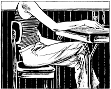
Is this a joke? The typos and word-art didn't stop my quest for knowledge, but by page 11 the choice of graphics broke me. I am giggling at the clip art - who is this guy? And what is he holding, a diploma or a billy club? How can i take them seriously when this is what they offering to sell their program?
Oh, and there are other gems too... UT offers a variety of Collaborative Programs to complement that prestigious degree.
"Great minds for your great future"...and the happiest student body ever. Grand Valley's catalogs don't even have this level of happy-sunshine imagery, though there is that story of the catalog that was Photoshopped to um, convey our racial diversity. (Yes, i shamelessly use 'Photoshop' as a verb. Deal with it)
So info-shopping is fun times all around. I do kind of wonder if this criticism is just my inner art-snob rearing its head from my Foundations days. Mismatching typefaces? No visual hierarchy? What barbarism is this? It could just be that part of the brain wanting use again, as it heads deeper into left-brained scholarly pursuits. Art classes were some of the best times ever, even if the focus here on modernist design got to be a bit much. Use that right-brain any way you can, kids! ;)


0 Comments:
Post a Comment
<< Home